Mika Launis
Early Career and Artistic Roots
Mika Launis began his journey as an illustrator while still in school, contributing artwork to publications like Teinilehti, Ylioppilaslehti, and the columns of Helsingin Sanomat. Although he initially envisioned himself as a doctor, school failed to capture his interest. Instead, he became involved in social movements, left both school and home, and began seeking work as a way to support himself. Illustration offered a creative escape and a practical solution, and soon Launis found consistent work with magazines.
One of his early inspirations was Kari Suomalainen, a revered Finnish cartoonist. Though Launis did not always agree with Suomalainen’s opinions, he admired the strength of his work. A pivotal moment came when he visited Henrik Tikkanen, another significant Finnish illustrator, and realized how far he still had to go in developing his skills.
Launis’s early professional work extended beyond magazine illustration to include posters, travel brochures, and corporate graphic design. One of his most renowned posters, For Peace, was adopted as an international peace symbol. During his mandatory military service, Launis decided to apply to the University of Art and Design Helsinki—he was accepted, marking the beginning of his formal artistic education.
A Pivotal Project in Lapland
Launis’s final university project would become a cornerstone of his artistic identity: illustrations for The Girl Who Became a Golden Pond (1982), a collection of Sámi folk tales told by Annukka and Samuli Aikio. Already familiar with Samuli and having connections in Utsjoki, Launis had local guides to help him understand the cultural context.
The project was deeply personal. He later learned that his great-uncle, Armas Launis, had once traveled the same regions collecting Sámi yoik poetry. The book marked a break from Launis’s political engagement and became what he calls the "key work" of his career. Its themes and visual language shaped all his future work.
The illustrations were published in several Sámi languages and in Scandinavian languages, including Finnish. In 1997, these images were featured on stamps as part of the Finnish Post’s Europe series. The original artwork now resides in Norway, with only a few sketches remaining in the artist’s possession.
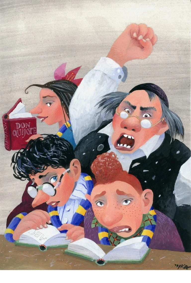
A Wizard Arrives
The Harry Potter series became an unexpected chapter in Mika Launis’s career. When he was commissioned to create covers for the Finnish editions, he was handed a rough translation of the first book and began his work with little fanfare. The publisher had no idea the series would become a global sensation. Indeed, the Finnish translation was initially supported as a small-scale, low-circulation title.
For Launis, the project was different from typical illustration jobs. Where he might finish two covers in a day, he chose to spend a full week on each Potter cover, plus time for sketches and revisions. The text resonated with him, and he believed that this book deserved special attention. Eventually, his vision of Harry Potter took shape: a thin, sad-eyed boy with messy hair, taped glasses, and a lightning bolt scar—a far cry from the cinematic version.
Embracing Mystery Over Action
Launis’s approach to illustration is subtle and painterly, favoring emotion and atmosphere over spectacle. He deliberately avoided the action-oriented, movie-style imagery. He focused instead on the inner tensions and relationships that defined the narrative. For Harry Potter and the Philosopher’s Stone, he chose to depict the magical chess match, a pivotal and symbolic moment that aligned with his view of the book as a world suspended in time.
He admired the absurdity of Rowling’s magical universe, particularly its rhythm: action only happens when outsiders intrude, and then everything returns to stillness. Launis’s restrained execution and muted palette reflected this sensibility. His use of aerial perspective—with warm foreground colors that cool into the background—created a ghostly sense of layered reality.
Technique, Symbolism, and Freedom
The multi-layered nature of Launis’s work created an immersive reading experience. He believed strongly that children’s literature, especially works for older readers, deserved a level of visual respect. His illustrations for the final book, Harry Potter and the Deathly Hallows, carry a church-like solemnity, capturing the overlapping of time, space, and reality that defines the climax of the series.
Despite the global phenomenon Harry Potter became, Launis never lost the creative freedom he had at the outset. Working under a modest lump-sum agreement (just under 700 euros for the first books), he retained greater autonomy than many artists working with billion-dollar franchises. He completed the covers without interference from film marketing or Hollywood character designs, allowing the Finnish editions to maintain their distinct identity.
Legacy and Perspective
Mika Launis views his Harry Potter illustrations as one coherent series among many works in his long career. Though he only ever watched the first film, he recognized its appeal while feeling it diverged from his own vision. He remains proud of having contributed a unique interpretation to the world of Potter—a version grounded in restraint, emotional depth, and artistic tradition.
His illustrations continue to stand apart for their quiet strength. They ask the reader to pause, reflect, and enter a space of layered meanings. In doing so, Launis preserved the heart of Rowling’s world while enriching it with his own artistic language—a language shaped in Lapland, honed in Helsinki, and shared with readers across Finland and beyond.